Speakers: session notes from Design by Ben Hall
I do some speaking, and really enjoy attending sessions by known as well as newcomers to the speaking scene as there is always something new to learn, and new people to meet. I’ve decided to share my notes from sessions as well as introduce readers to the speakers- hopefully getting more people to attend, and speak of course!
The notes is what I thought I heard, and there is always interpretation as well, therefore my notes might not 100% represent what the speaker intended to say- keep that in mind when reading, and be supportive of people dedicating so much time to share :)
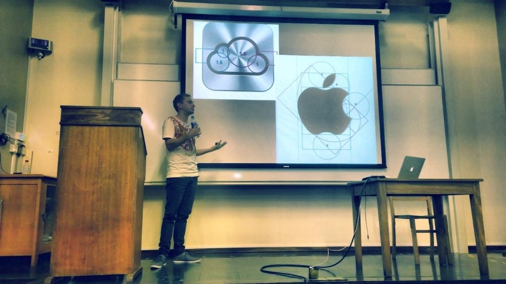
This session was delivered by Ben Hall atDDD East Angliaand was about design

These are my rough notes, I’ll clean them up tomorrow and add some images as well as we are going to the pub soon ;)
In terms of design whitespace adds breathing space- both for images as well as text so it’s worth thinking about and playing around with. The same goes for the use of emphasis which adds a big impact Be that by changing the color of a word, or using a different font altogether.
There is also something called the Golden Ratio- which describes the perfect relationship between two things. It’s is: 1.61803398875 , Wikipedia has a nice write-up on that.
When we look at something and it feels like something isn’t right its often about cognitive science, some things have a higher cognitive cost.
Square corners take our focus to the outside of the rectangle instead of inside like rounded edges do, it’s interesting that Microsoft chose the square design, and we have seen complaints around that (although some quite like it).
Images
Images and icons are important- preferred over reading as users recognize things faster in image form.
Images introduce desirability. Provide good images, but give users what they expect- not an overblown reality (stock photos).
Blurry images as background creates a connection between the elements (in focus and out of focus), make sure you drive user attention to what you want them to see. Hide what the user doesn’t need to know- and make the information match what the user expects to see.
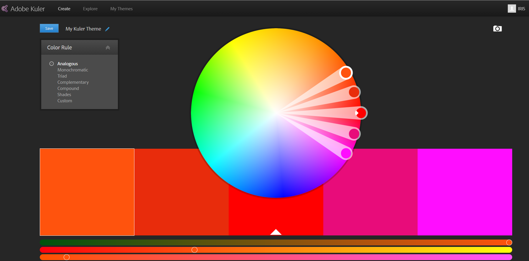
Colors
Different concepts:
Complementary
Triadic
Mono chromatic
Compound
Shades
Two main font types
Serifs and Sans-serifs. Serifs have small lines tailing from the edges of the symbol
Caps lock seems more aggressive as we are not used to it so we struggle more to read it (debated theory)
Main point, if it looks better it works better
Here are some tools that I (Iris) like to use for UX/design (I’m however not a UX person, so I’m trying to improve that):
Picking colors that work together

For ideas: Fashion palettes blogs such as:
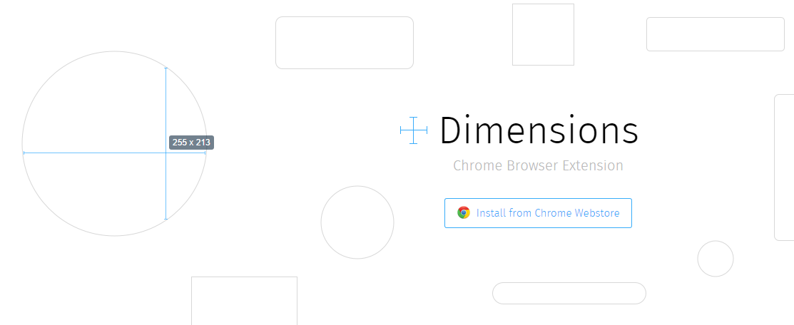
New, measure everything in the browser

Eye tracking for testing UX / user usability
(yes I actually have one!)
And of course more. I’ll have to write a more comprehensive post
Comments
Last modified on 2014-09-13
